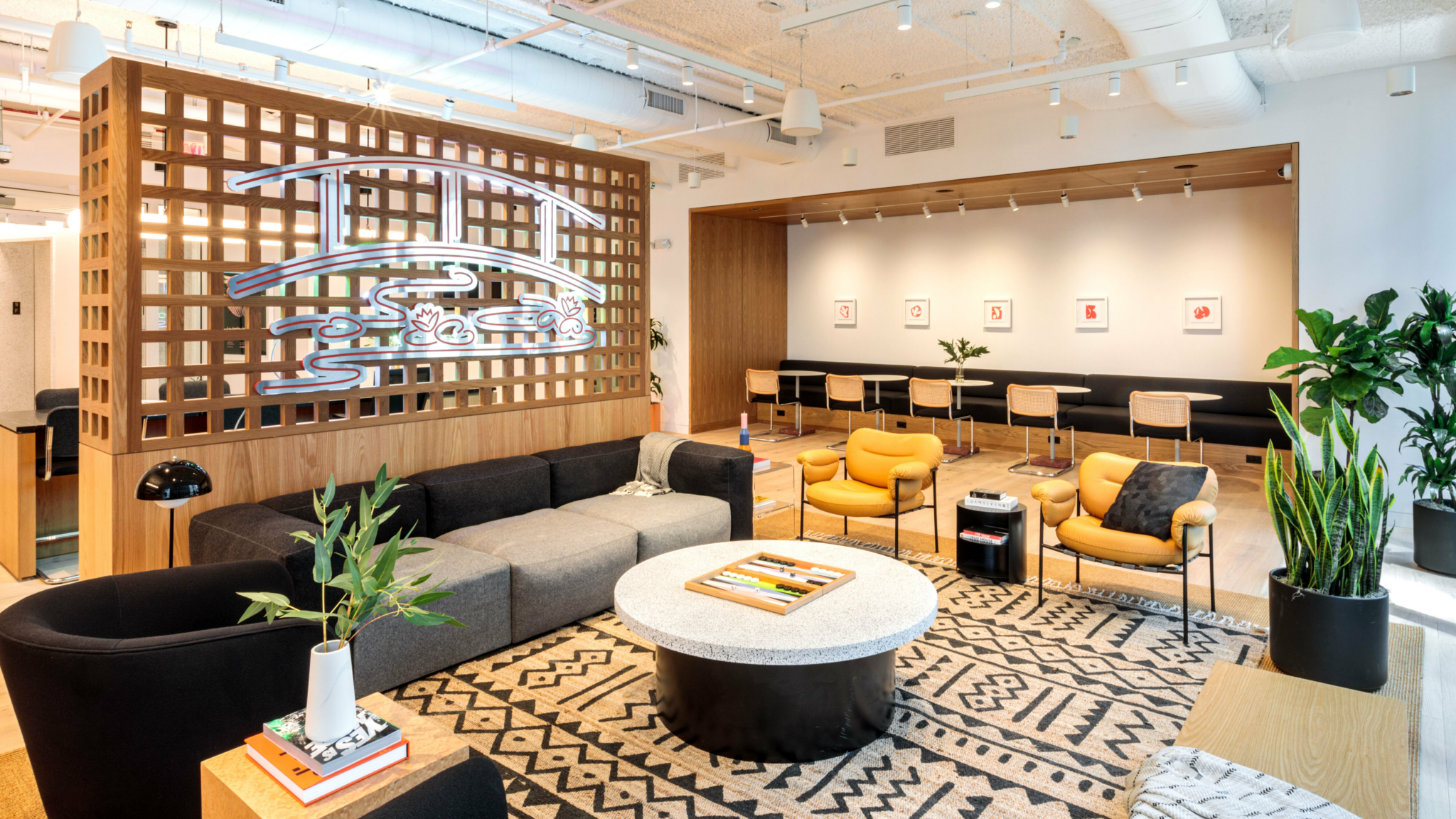
Every WeWork space is intentionally designed to foster productivity and collaboration. Designed to Inspire delves into the architectural and artistic elements of these spectacular buildings.
Twenty years ago, Chicago’s Fulton Market was a sea of factories and industrial warehouses, a centre for meatpacking and fishmongering. Fast-forward to the present and it’s one of the city’s most dynamic and highly sought-after hubs.
Many of the original concrete-and-steel structures now contain restaurants, cafés and bars, not to mention tech company offices. A former factory is now home to a Soho House, and Google’s Midwest headquarters occupies a sprawling building in the heart of the neighbourhood.
Right at the nexus of all that energy, on a pedestrian street a block from the L train, lies WeWork 167 North Green Street. ‘It’s at the heart of the startup scene,’ says Alexander Leonard, a senior design lead at WeWork.
Want to learn more about flexible work?
In contrast to the hustle and bustle outside, the lobby of the opulent new building projects quietude across the vast space. ‘It’s one of our grander entry experiences,’ Leonard says. ‘When you first come in from this bustling neighbourhood, the feeling we wanted to give the members was this sense of calm.’ From the entrance, members get views of the Chicago skyline both to their left and right as a way to introduce light and a clear sense of place.

To the right is the community desk, and its design sets the tone of understated luxury that runs throughout the entire location. ‘The community desk has a black marble top with a white oak tambour wood base, so already you’re getting a soft material with a touch of something a little more luxe,’ Leonard explains.
‘It’s meant to be a signature building in the neighbourhood,’ says Jesus Garcia Alvarez, a design manager at WeWork. ‘We knew that this was going to be one of our most visible locations in Chicago – and in our portfolio, frankly.’ One perk that’s already popular with members is access to the full-size basketball court on the rooftop, surrounded by floor-to-ceiling windows. ‘The views are truly stunning – the city skyline is the backdrop while you play basketball,’ says Alvarez.
Wellness is a key part of our design, and bringing a strong connection to outdoor space was front of mind.
Jesus Garcia Alvarez, design manager at WeWork
In addition to unique features, this location features WeWork’s latest performance standards. ‘There was a particular emphasis put into the acoustical performance of the project,’ Alvarez says. ‘We’ve included acoustical ceilings and panels throughout the project, carpet in selected locations and denser demising walls between offices.’
One key innovation may not be instantly apparent to members, but they’ll undoubtedly appreciate it nonetheless: the design team integrated tunable white lighting throughout the lounge spaces, which subtly shifts through the red and blue ends of the light spectrum throughout the day, helping members stay focused even in the early morning or late evening hours.
‘During the morning, it specifies light made to make you more alert, less drowsy,’ Leonard says. ‘It allows us to generate different scenes, which align with the information we have about supporting natural circadian rhythms. It also plays into the broader strategy of how we might be using this space.’
Given the significance of the local neighbourhood, the design team also wanted to honour the past and present throughout the space. ‘Chicago has such a rich history with its roots in modernism, and the base building really speaks to that in terms of its material palette,’ Leonard says.
The team incorporated the original, beautifully formed concrete into the design, subtly offsetting it with balancing organic materials. ‘We contrasted the concrete and metal by incorporating a lot of live materials, like white oak, plants and marble,’ Leonard says.
More direct nods to Chicago’s rich local culture come through the art, which was created by the in-house graphics team as well as local artists such as Cody Hudson and Pamela Staker. WeWork also collaborated with ArtLifting, a social enterprise that empowers artists.
‘ArtLifting uplifts the work of artists impacted by homelessness and disabilities and also challenges those who are looking at it,’ Leonard says. ‘We were really glad to be able to work with them.’
One of the biggest opportunities for designers was the sheer scale of the floors. ‘These floor plates are around 4,600 square metres, so it’s almost like having two office buildings combined,’ Alvarez says. ‘However, one challenge with large expanses is the wayfinding. We strategically located secondary lounges and nook areas to improve navigation for our members. It’s a lot easier to get around when you have small breakouts scattered throughout the plan.’
Perhaps one of the best moments of surprise is access to outdoor space. WeWork 167 North Green Street sports three terraces: two public and one attached to a private office. From these vantage points, members can enjoy panoramic views of the Chicago skyline.
‘It makes a big difference when you can be in your workplace and have access to fresh air so that there’s less stress in your working day,’ Alvarez says. ‘Wellness is a key part of our design, and bringing a strong connection to outdoor space was front of mind.’
It’s particularly fitting that as members stand outside here, they’ll be able to witness the neighbourhood around them continue to transform and grow. Fulton Market has already reinvented itself as a central part of Chicago’s vibrant, forward-thinking future. Both the building at 167 North Green Street and the workspace contained within were engineered to lead the way.
Diana Hubbell has spent more than a decade covering design, art, travel and culture for publications including The Washington Post, The Guardian, Eater, Condé Nast Traveler, The Independent, VICE, Travel + Leisure, Architectural Digest, Atlas Obscura and WIRED, among others.
Rethinking your workspace?


