Every WeWork space is intentionally designed to foster productivity and collaboration. Designed to Inspire delves into the architectural and artistic elements of these spectacular buildings.
Over the last decade, Berlin has emerged as one of Europe’s most innovative tech startup hubs, thanks to a steady influx of creatives and entrepreneurs. Much of the scene remains concentrated in Mitte, the city’s buzzing central district. WeWork Dircksenstraße 3 lies in the heart of it all – a stone’s throw from the iconic Berliner Fernsehturm, a TV tower erected in 1969 – in what was formerly the German Democratic Republic (GDR).
WeWork Dircksenstraße 3 is ‘in the geographic and spiritual heart of Berlin,’ says Yana Chirovich, senior interior design lead at WeWork. ‘The area has a rich and complex history. It’s very close to Alexanderplatz, which is one of the biggest public squares in Berlin.’
After the fall of the Berlin Wall in 1989, the German government transformed this space into a sprawling commercial centre packed with shops and restaurants. Within a short walking distance from the workspace are historic landmarks such as Museum Island, a UNESCO World Heritage Site that consists of five world-famous museums on one island, and the Kino International, a historic cinema that hosts many of the events in the annual Berlinale Film Festival.
Unlike the repurposed Soviet-era architecture characteristic of much of the former East Berlin, WeWork Dircksenstraße 3 occupies a striking, brand-new building designed by KSP Architekten. The WeWork design team then layered in their own design elements to create a space that embodies both the past and future of Berlin.
‘The concept for the design of the building was, in essence, a play on German culture and the strong history tied to this place,’ Chirovich says. The stark white cement facade and exposed concrete echo the minimalism of the GDR, while the interior strikes a different note. ‘We integrated the simplicity of Bauhaus with midcentury touches,’ she says. ‘We also drew inspiration from Funkhaus Berlin, a broadcast centre from the GDR, which now houses one of the city’s most famous music recording studios and concert venues.’
We tried to mix different functions here to erase the boundaries between work and play.
Yana Chirovich, senior interior design lead at WeWork
Homages to Berlin history are also interwoven throughout the custom art pieces. From Marlene Dietrich to David Bowie to techno, Berlin’s musical legacy has had a profound impact on the world, which many of these works reference. ‘For decades, Berlin has been known for its exceptional nightlife and live music,’ Chirovich says. ‘So the custom artworks reflect the music scenes by exploring juxtaposing art themes of nostalgia and futurism.’
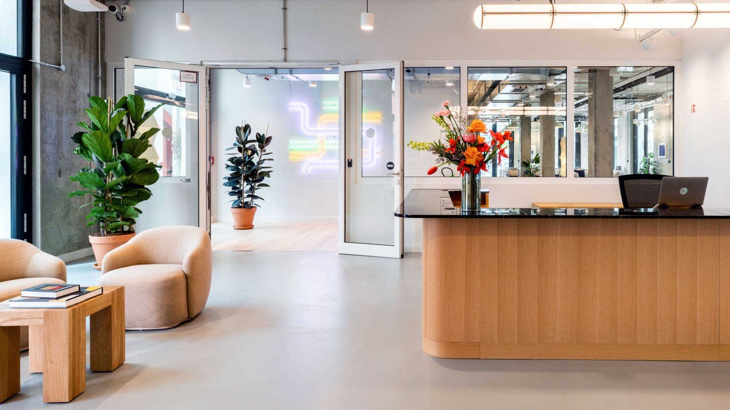
From the moment members enter WeWork Dircksenstraße 3, the design makes a serious statement. ‘When you first step into the space, you’re greeted by this colourful courtyard, which we share with a boutique hotel, as well as a custom neon art piece that invites members to explore the spaces,’ Chirovich says. That neon echoes the lines of the U-Bahn and S-Bahn map of the nearby central train station.


Past the community desk, members find themselves in a high-ceilinged space flooded with natural light. Large windows ensure impressive views in every direction, from the courtyard to the city skyline. ‘We have a west-facing side, so we have beautiful light in the evening,’ Chirovich says.
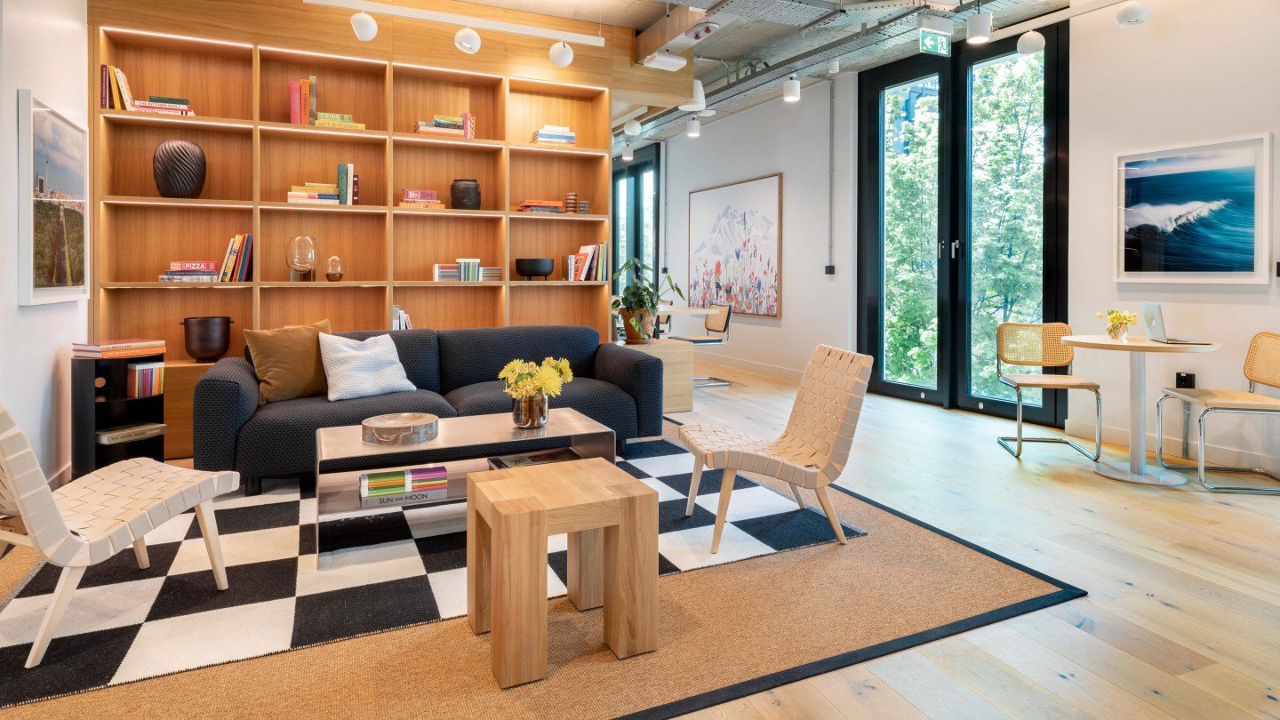
The design team aimed to create an interior space that felt both industrial and luxe. ‘We wanted the juxtaposition of exposed concrete with warm finishes in oak,’ Chirovich says. ‘We’ve used a neutral palette for fabrics, offset by pops of colour from the custom artworks.’
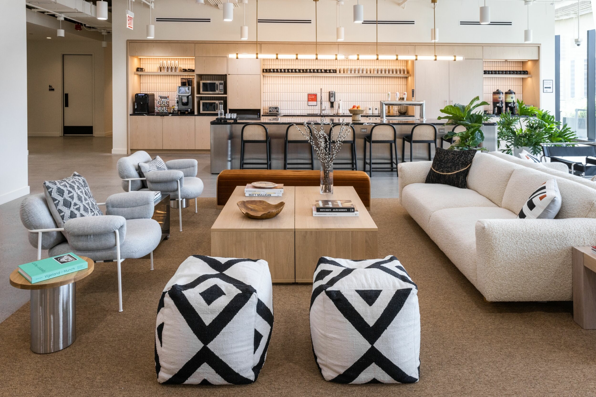
This contrast is particularly striking around the barista bar, a free espresso bar available to all members, which uses patterned black-and-white tiles and custom art for maximum impact. ‘We played with Funkhaus-inspired tiles set against a backdrop of colourful artwork,’ she says.
Designed for work and play
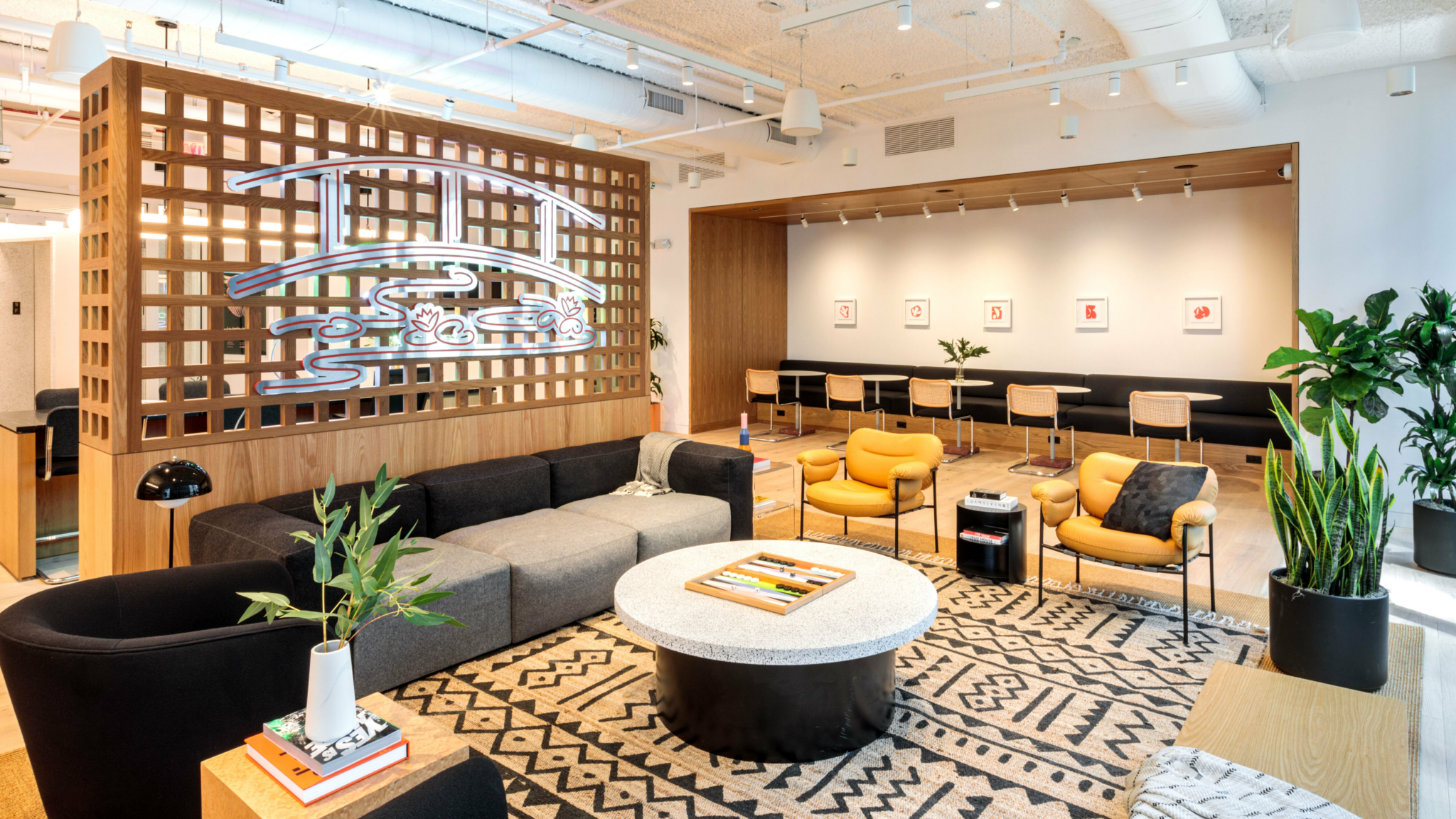
As the day winds down, the energy at WeWork Dircksenstraße 3 ramps up on the sixth floor, which acts as both the mezzanine and the main centre of gravity. ‘We tried to mix different functions here to erase the boundaries between work and play,’ Chirovich explains. The member journey on this floor goes through a hot desk area and a lounge area, before culminating in a space with a pool table, games and, of course, a pantry area serving draft beer. ‘Towards the end, the journey brings us to this beer island.’
Even without the free-flowing libations, members often organically gather in this space because of the thoughtful design. ‘There are exposed concrete ceilings offset by lush, textured fabrics, like velvet on the furnishings,’ Chirovich says. ‘The entire space is double-height. It’s very airy and you have a spectacular view of the sunset.’
While that striking view can be enjoyed through the space’s enormous windows, it’s even more special when viewed from the outside with a beer in hand. ‘There’s a wraparound mezzanine balcony with a view of the TV tower,’ she says. From that terrace, all members can soak up one of the city’s best views.
To accentuate the room, the in-house graphics team decorated those double-height walls with geometric patterns extending all the way up. Strategically placed lighting fixtures also help to draw the eye upwards. ‘Here, we wanted to embrace the height of the space, so we extended lighting up to the ceiling,’ Chirovich says. ‘Accent lights within the bookshelves create an inviting atmosphere in the evening.’
Custom artworks also help set the tone for the mezzanine floor. ‘We created these strong graphic murals to support the dynamic theme here,’ Chirovich says. Many of the murals here draw on the aesthetic of Funkhaus Berlin, while a lightbox installation speaks to the building’s immediate surroundings. ‘That’s another custom piece of artwork that’s inspired by the sunset,’ Chirovich says. The work, which depicts a luminous orb set against a pastel pink background, adds warmth to the entire room.
For members looking to make a name for themselves in Berlin’s burgeoning startup world, or wanting simply to tap into the pulse of the German hauptstadt, there’s no better place to start. The design at WeWork Dircksenstraße 3 seamlessly integrates elements of the city’s architectural and cultural history, while looking ever forward.
Diana Hubbell has spent more than a decade covering design, art, travel and culture for publications including The Washington Post, The Guardian, Eater, Condé Nast Traveler, The Independent, Vice, Travel + Leisure, Architectural Digest, Atlas Obscura and Wired, among others.
Rethinking your workspace?


