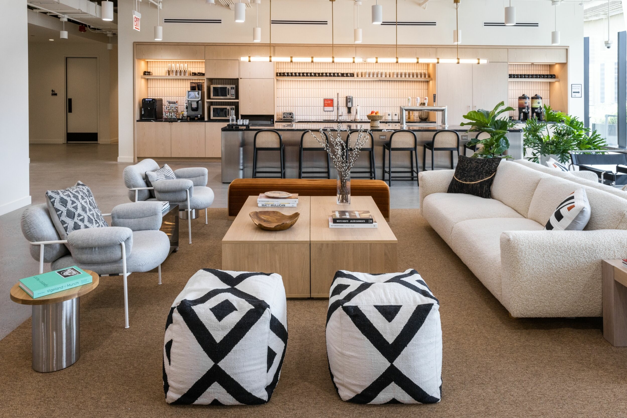
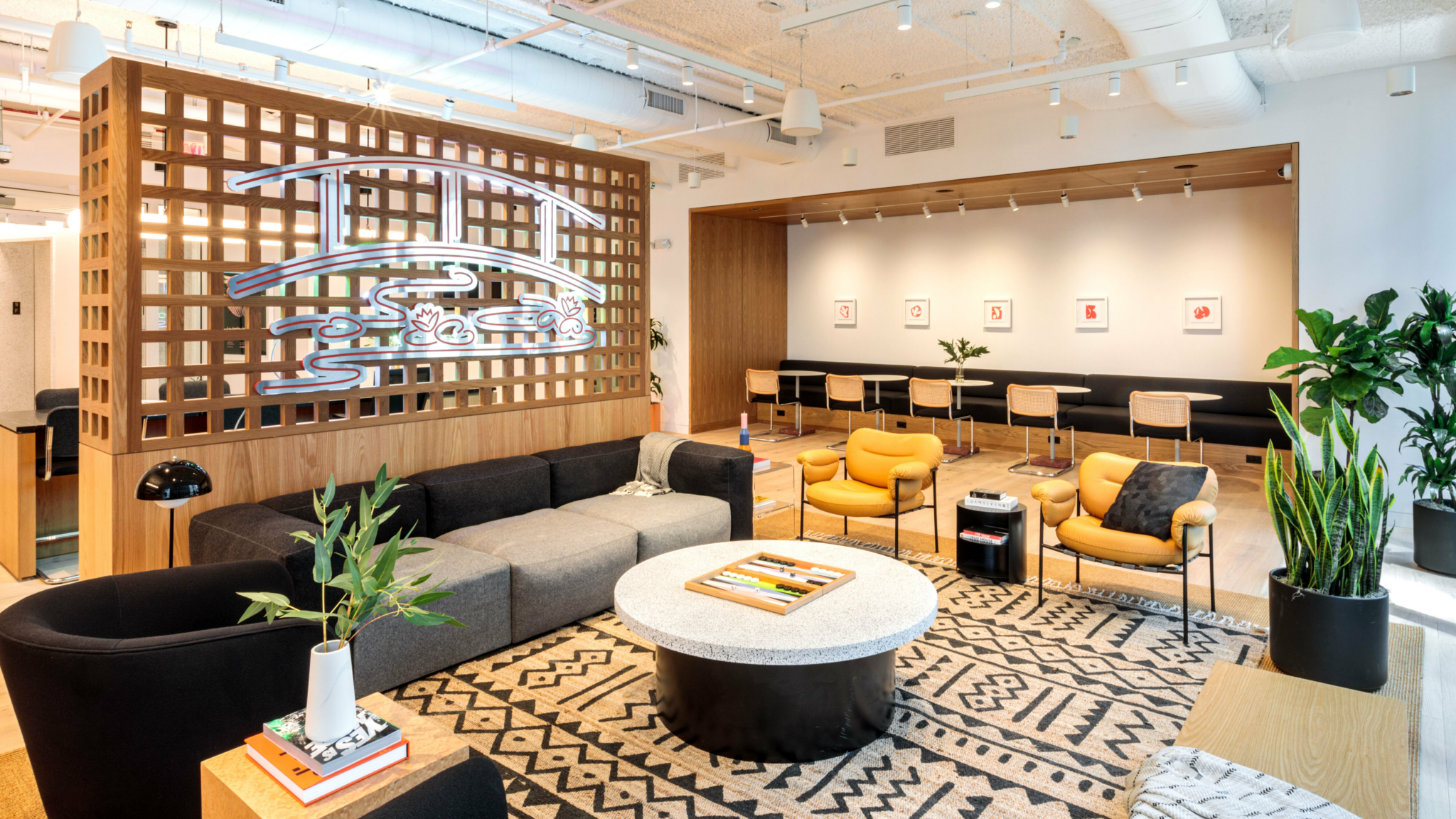
Every WeWork space is intentionally designed to promote inspiration and collaboration. Designed to Inspire delves into the architectural and artistic elements of these spectacular buildings.
What happens when you combine a US Class A building with snow-capped mountain views? Welcome to WeWork 250 Tower—located in a 16-storey building in Salt Lake City. In order to cater for the new workforce, The Tower recently underwent its first major renovation, with a refreshed and modernised interior design and amenities. The building features light-filled lounges, airy conference rooms, and a spacious outdoor terrace, all with unparalleled views of the Wasatch Mountains.
‘What makes it special is not just the building itself, but the location and the incredible 360-degree views,’ says Alexandra Low, director of design at WeWork, whose team leads the design of WeWork spaces.
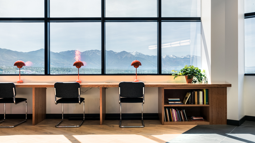
It is one of the few office towers with 360-degree views in this high-elevation desert city that is surrounded by peaks. The views from WeWork 250 Tower offer vantage points to the centre of Salt Lake City, with the State Capitol building to the north, University of Utah to the east, and a panoramic view of Salt Lake Valley to the south.
‘One thing that is important in our design ethos is that we work with the natural elements of the building…[and] we wanted to work with the natural architecture of the space,’ Low says. This ‘outside-in’ approach also helped create an environment conducive to productivity.
Taking cues from nature
WeWork 250 Tower space takes up the top two levels of the building. It has decorative touches and elements inspired by the outdoor surroundings, from the woodwork through to the customised artwork.
The woodwork, a key design feature, was custom-built in-house, and the rest of the design took off from there. ‘The team selected a walnut wood with a dark veneer finish, [which] perfectly balances the white oak flooring, high ceilings, and white walls, so that it doesn’t come across as too overbearing,’ Low says.
What makes it special is not just the building itself, but the location and the incredible 360-degree views.
Alexandra Low, director of design at WeWork
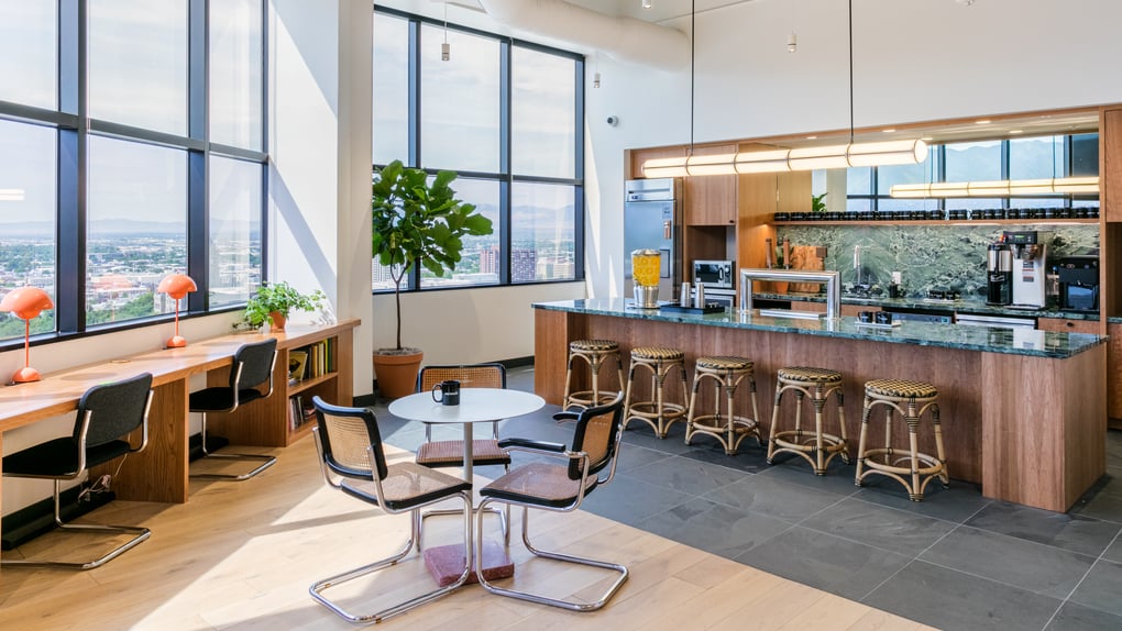
The design team also added touches of greenery wherever they could, selecting plants natural to the environment that would complement the colour palette. In the pantry, green marble worktops echo the greenscape beyond the glass. They also added in natural fibres, like rugs made of sisal, in the meeting rooms and lounges. ‘We’ll sometimes layer over an accent rug that has texture but is muted and not too loud,’ Low says.
Members also get to enjoy WeWork’s full suite of amenities and perks at ‘Club 250’ on the first floor, including access to a fitness centre, showers, a gym, an outdoor patio, an espresso bar, and a recording studio, all in the building. They can take the lift to the penthouse, which offers 20-foot ceilings up through the open space to the deck.
Moments of calm
The intention behind the design of WeWork 250 Tower was to make the space feel cosy, accessible, and homely. Decorative lighting adds to the ambience. This includes terracotta lamps at the hot desks, which give the areas a more private feel in a public space. ‘It’s a small vignette that elevates the user experience,’ Low says.
The furniture in the space mixes both modern, high-end pieces with one-of-a-kind vintage finds for an unexpected, unique feel. The design team collaborated with Knoll to design Cesca chairs that have been customised with WeWork’s own fabric and rattan selection.
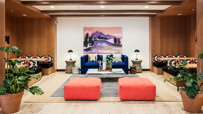
One standout space, Low says, is a special nook featuring customised upholstered banquettes and chairs made of Pendleton blankets, along with hero artwork hand-painted by the WeWork arts and graphics team. ‘It’s a moment away from all of the desks,’ she says. ‘It’s quieter, private, and cosy.’
Throughout 250 Tower, visitors will encounter a striking combination of prints, posters, and original art. A big painted mural in the lounge makes an immediate impact. ‘This one has a woody vibe and feel,’ says Low, in keeping with the overall design vibe, ‘but in a different palette of pinks and greys to balance out the space.’
Designed for productivity
‘One of the things that makes this workspace so successful is that people want to work in the lounges and public spaces because they feel really good,’ Low explains. ‘People feel so comfortable that they put their feet up on the furniture…and that’s the environment we’re trying to create.’
WeWork’s lighting team considers natural lighting in the space as its own design element. In areas where natural light is not possible, the team has applied LED lighting technology to promote energy efficiency and sustainability.
As if the building and its views weren’t enough of a draw, the tower’s location is conducive to networking and community building. It’s within walking distance of Beer Bar, Taqueria 47, and a host of other restaurants, and it’s only a few streets away from the Gallivan Center, a public plaza for exhibits and festivals, as well as the TRAX station for public transport.
Lastly, WeWork 250 Tower welcomes four-legged family members (always a plus), making it no surprise that 250 Tower feels like home for so many.
Melissa Yap is a content marketer for leading technology platform MNTN and a freelance writer with Australian roots, now based in Los Angeles via New York City and London. Her writing has been featured in Fortune, Huffington Post, Monocle, CNN, and Adobe.
Rethinking your workspace?


