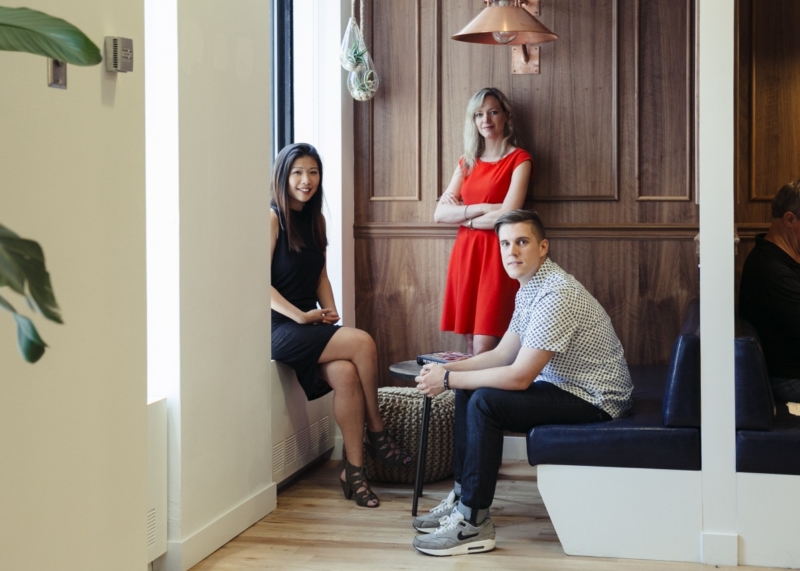
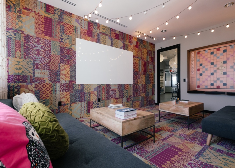
The first thing that greets a newcomer to WeWork, before the fresh smell of coffee, the overhead sound of music, or the warm feel of community, is the look. It is difficult to describe, and changes from building to building and even floor to floor.
Yet it is immediately recognizable and an important part of what sets WeWork apart from other work environments. I sat down with some of WeWork’s most senior designers and employees, Jeremiah Britton, Cindi Leung, and Kimberly Kolkovich, to discuss how they’ve helped create the “WeWork look.”
The backgrounds of the designers, like their designs, are varied. Britton worked in illustration and graphic design, while Leung and Kolkovich focused on interior architecture. Their pasts do share one thing, though: dissatisfaction with the ordinary, and a craving for innovation.

“I used to work in a gray cubicle office space,” Britton recalls. “I hated it.”
Kolkovich helped design some of those same cubicles, with little creative input she could deliver to her “dinosaur” boss. Leung’s college thesis project was on the relationship between community and workspaces. “Like all the things we’re doing?” Britton jokes. “Yeah,” Leung replies with a laugh. “Like all the projects we’re doing.”
The process of designing a WeWork workspace starts early. Leung and Kolkovich, as design project managers, begin plans before the lease on a building is even signed.
I used to work in a gray cubicle office space. I hated it.
Jeremiah Britton
“They design the spaces, from where the offices go down to what pillow is on the sofa,” Britton explains. “They start with where the glass and the walls and the beams go and finish with what couch and what table and dry erase board goes in each room.”
Britton, as the art director for the interior design team, is then assigned specific projects, like graphics, murals, and wallpapers.
Britton, Leung, and Kolkovich are inspired by geometry, pop culture, street art, nature, and even the neighborhood where a building is located. It’s not limited to pictures of iconic landmarks or local celebrities: it’s also about the culture of the area.
In Los Angeles, Britton explains, terraces were important because Californians enjoy sitting outside. At the Berkeley location, one of Leung’s favorites, carpets crawl up the walls and tie-dye backgrounds complement quotes from the inventor of LSD.
“We went a little bit crazy at Berkeley,” Leung says, “which was fine at Berkeley.”

Sometimes, a new building is not just a canvas, but also a piece of art. The designers will often incorporate a building’s particular quirks and characteristics.
“SoHo and Meatpacking in New York [City] came with crazy beams, exposed brick, and really old floors that we just left because they were cool,” says Britton.
In the Los Angeles Fine Arts Building, the lobby already had a detailed mosaic. Leung and Britton admired this detail, but wanted to add their own twist. Their solution? Adding the face of hip-hop legend Tupac Shakur.
The design team’s fascination with rap is one of the few consistent trends of WeWork’s design, and there’s logic behind it. Rappers keep things strange and fun, Kolkovich says. Rap is urban, and so is WeWork. But more profoundly, the common themes of rap are in tune with the company’s mission.
“A lot of rap songs reference ‘starting from the bottom,’” says Leung. “I think there’s a certain reference to how we cater to small startups starting from nothing and help them grow.”

Like many startups, the design team is constantly innovating for the needs of the growing community. Interconnecting stairways allow closer connections between members on different floors. Lounges, which used to be centrally located in each building, are now placed closer to windows so people can enjoy some natural light. Plants are practically mandatory for the designers.
And like successful startups, growth brings change. Gone are the days when WeWork designers would draw floor plans on walls they had just built. The design team has grown considerably, and the pace of expansion has required some rules to be implemented. Kolkovich says the struggle now is to keep the same raw design feeling while making sure that each space feels unique.
But for all its challenges, growth has also brought many opportunities. Because new buildings are opening so quickly, Kolkovich explains, “We’re able to improve on a product time and time again.”

Ultimately, a WeWork designer’s job is about building a legacy that inspires the future.
“There’s immediate gratification, but there’s also a lasting presence,” Britton says. “If you’re designing apps or an ad that will only last for three months, no one appreciates it when it’s gone. Here, you finish a building by pulling three all-nighters to get it ready, then the next morning, members move in and post pictures on Instagram, telling their friends. You feel like you’re actually helping people love coming to work every day.”


