As a brand, WeWork has always represented the more human elements of work, the ones that are irreplaceable when we’re apart and enhanced when we’re together. The experience you have when you walk into a WeWork space is unmistakable. It’s not only the result of beautiful, intentionally designed spaces, but it’s also the warmth and connection you feel from the WeWork community. This is the heart of our story; the combination of space and people that created the first real brand in commercial real estate. You could say, we created a category of our own. Because while many flexible workspaces today try to walk in our footsteps, none have captured the WeWork experience – which is why other spaces will only ever be “like a WeWork” space.
As the world of work continues to evolve, so have the products we offer to our members every day. Now, we’ve taken steps to develop a more impactful way to showcase WeWork’s diverse and flexible product and unique value proposition to the world. Through a holistic approach we’ve evolved the WeWork logo and introduced new colors, hand-drawn illustrations of people and spaces, and a custom typeface.
Over the last several months, our brand team, along with WeWork member and creative brand agency Franklyn, designed subtle yet impactful changes that maintain the soul of our brand and bring us into a new era. It was no surprise that a WeWork member company best understood how we wanted to maintain the soul of our brand, and partnered with us to elevate our identity in a way that reflects where the company is today. This new brand identity is an evolution, not a revolution.
Patrick Richardson, Co-Founder, Franklyn, says “As WeWork members, we have firsthand experience of the magic you feel working in a WeWork space. Driven by both sides of the brain, they’ve thoughtfully designed an energizing yet functional product that fosters the kind of community that makes you want to come to work. WeWork blurs the line between art and science, emotion and intellect; and it was this duality that inspired the company’s new visual identity.”
How it will show up
The new brand identity will come to life across all of WeWork’s channels – digital, social, internal and external communications, through member touch points across our locations worldwide and in our app – and can be used flexibly depending on the audience and context. The new logo design and bespoke typeface is intentionally designed as an evolution of the existing WeWork brand, so old and new designs can live alongside each other as we gradually update our assets on a global scale.
A closer look at the design elements

Logo
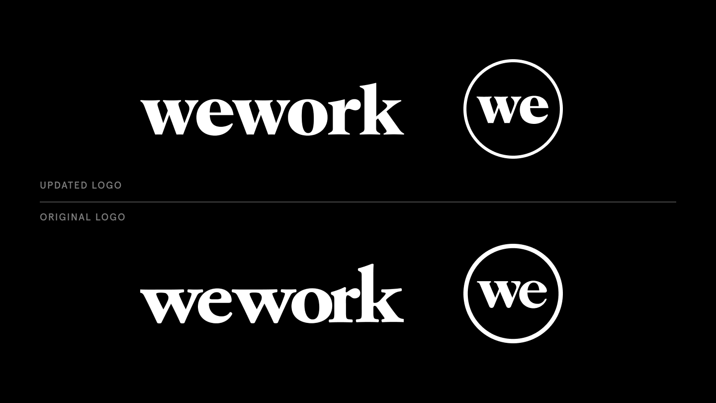
Retaining the overall shape, subtle curves and lowercase approach of the original logo, our updated logo design remains recognizable while emulating a modern, professional and functional design that can be scaled as needed. We felt it to be important that the old and new logo design would and could coexist.

New Typeface
‘WeWork Serif’ – developed by A+ in collaboration with Franklyn – is our new custom typeface that creates continuity between our logo and our copy for brand consistency and confidence. This will be complemented by our secondary typeface, Aperçu Pro, for body copy.

Secondary Color Palette
Our new focused set of secondary colors express the full range of our personality. Complementing our trademark black and white logo, each color represents the various aspects of WeWork’s personality, and how they resonate with our members.

Illustrations
To represent the many ways our members work and interact with our spaces, our new illustrations showcase our evolving product range and amenities. The hand-drawn illustration style creates continuity in the brand system by carrying through the human element of the office, and combines this with the flexibility that is needed for individuals, teams and organizations to craft their best day at work.


Product-driven and people-first approach
Doubling down on our current photography approach that highlights our uniquely designed spaces, we are introducing more detailed shots that showcase the art and science of a WeWork space – including the functional and thoughtful design of our spaces – as well as the human touch of our spaces, and how our members use them.


About WeWork
WeWork (NYSE: WE) was founded in 2010 with the vision to create environments where people and companies come together and do their best work. Since then, we’ve become one of the leading global flexible space providers committed to delivering technology-driven turnkey solutions, flexible spaces, and community experiences. For more information about WeWork, please visit us at wework.com.
About Franklyn
Franklyn is a full-service design studio based in Brooklyn. Across all industries, from startups to multinationals, we provide thoughtfully crafted design that transforms the organizations we work with into the brands they dream of becoming. Join us outside of your comfort zone and we’ll make the process as delightful as the results. franklyn.co
