Every WeWork space is intentionally designed to foster productivity and collaboration. Designed to Inspire delves into the architectural and artistic elements of these spectacular buildings.
In the heart of the U.S. capital, WeWork 200 Massachusetts Ave NW resides in a modern and gleaming glass-encased structure. The new construction provided a blank slate for the WeWork design team, which often plans spaces in historical buildings. But it also came with some unique challenges.
“If we go into a landmark building, we’re going to work directly with what that building already offers in order to create special moments,” says Alexandra Low, a creative director at WeWork. “Here, one of the challenges was bringing character and personality onto an empty canvas without making it feel forced.”
Ties to the city
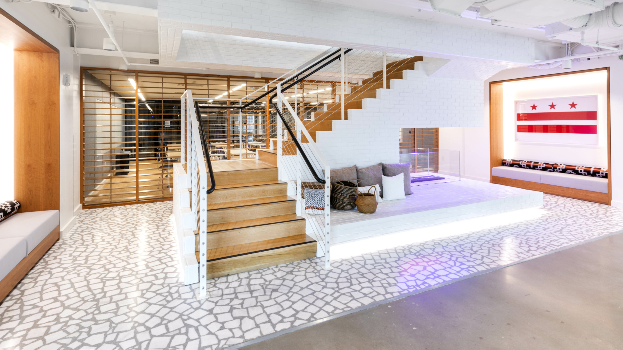
One must for the design team: making sure WeWork 200 Massachusetts Ave NW reflected the vibrant nature of its home city. Some of the aesthetic nods to Washington, D.C., are subtle—such as the use of cherry wood as a reference to the capital’s iconic cherry trees—while others, like original artwork depicting the District of Columbia’s flag, are more overt. One of the clearest references is an homage to one of the city’s most famous institutions, which happens to be located a 20-minute walk from the space.
“There are a lot of cues that draw inspiration from the Smithsonian National Air and Space Museum,” Low says. “The body of the community bar table is clad in riveted sheets of metal that look like the same riveting and metal detailing that you see on an airplane.” Set behind the community bar is a custom neon artwork that suggests an airplane’s propeller in motion.

While the community bar trumpets the thematic connection to all who enter, the design team opted for a more subtle, nuanced approach throughout the rest of the space. “We want it to be playful, fun, and accessible, but we also don’t want it to become too gimmicky,” Low explains. “I think that we pushed that boundary as far as we felt was appropriate for that community bar, then pulled back in other areas.”
Striking a design balance
The rest of WeWork 200 Massachusetts Ave NW artfully walks the line between sleek minimalism and mid-century modern. Another standout design reference is the stunning aggregate terrazzo staircase in the library, featuring oversize inlaid pieces for a showstopping effect. Brick veneer on the sides helps round out the overall aesthetic.
“A big design moment is a riff we did on a mid-century hearth,” Low says. “Underneath, we created a custom fire pit, but using neon. So you’re looking at a very modern, somewhat deconstructed interpretation of a mid-century stone hearth.”
We wanted it to be original, unpretentious, comfy, and fun, but we also wanted it to feel elevated and functional.
Alexandra Low, a creative director at WeWork
The team aimed to keep the space feeling of-the-moment, but not sterile. “If you work too much within the confines of minimalism, you can end up with a space that feels cold,” Low says. “We wanted it to be original, unpretentious, comfy, and fun, but we also wanted it to feel elevated and functional.”
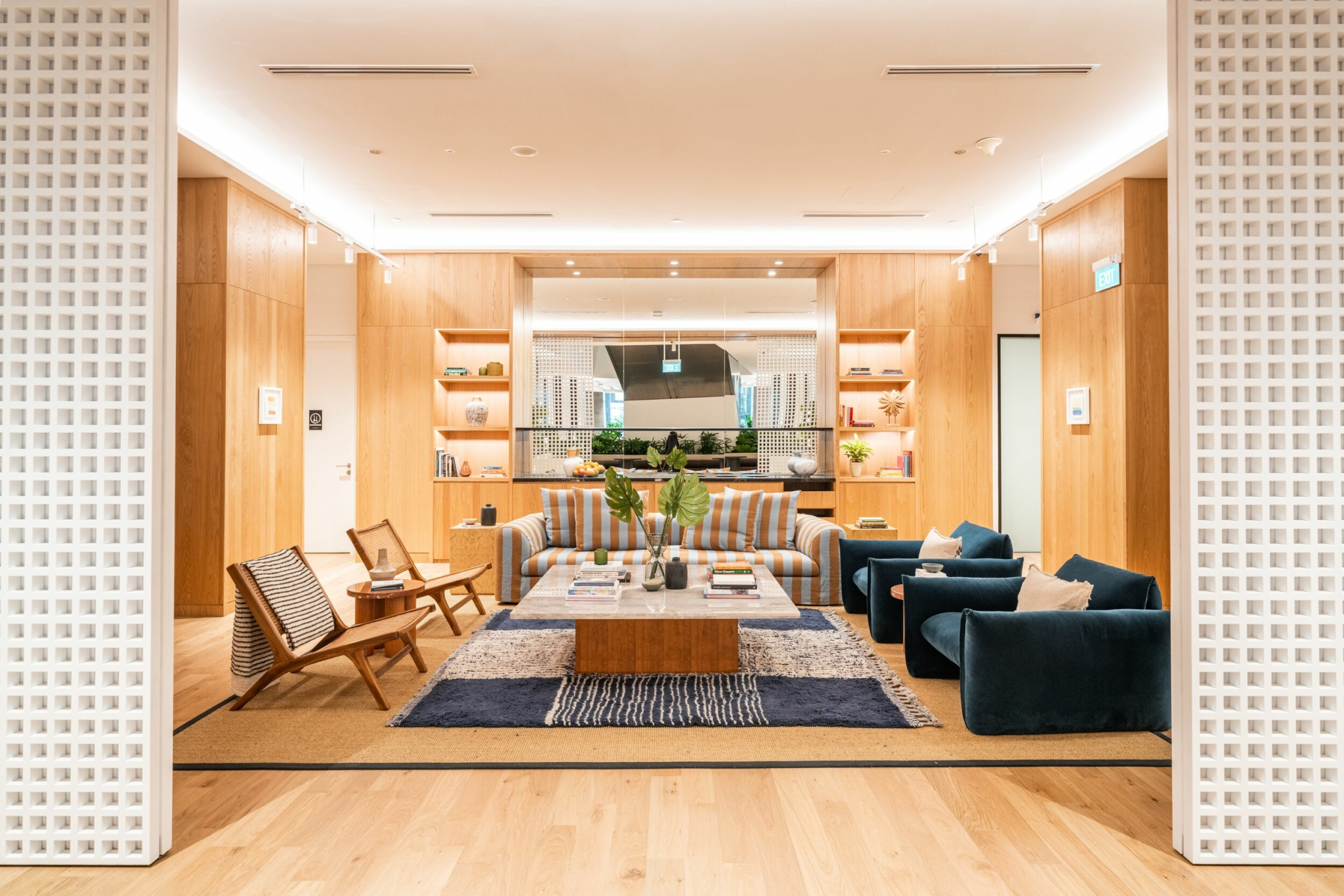
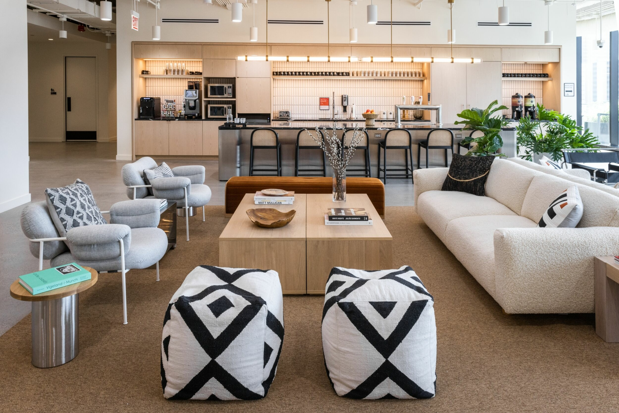
Materiality helped strike that critical balance. A palette of whites, grays, and blacks is punctuated by brightly colored upholstery and original graphic works to provide contrast. “You have the coolness of the polished gray concrete floors,” Low says. “Then you have the metal from the community desk and other polished metal accents. Then, in the pantries, you have the white brick veneer on the islands, a semi-gloss white tile on the backsplash, and a charcoal laminate on the actual doors. So that’s a really sleek, cool palette, and on top of that we add warmer tones and texture.”
Cherry wood millwork interwoven throughout the space goes a long way toward adding those warmer notes, as do textured rugs. “We’ll do a huge sisal rug, which really helps delineate that area,” Low says.
All of these elements strikingly come together in the pantry area, which manages to feel playful and sophisticated at the same time. The overall impact is similar to an artist’s loft—an effect accented by all of the original works produced by WeWork’s in-house team of graphic designers and artists. “In the pantry, you see this very sleek space, but then you have warm wood and bright orange custom chairs and hanging swings,” Low says. “All of a sudden, you’ve created small moments of gathering and it doesn’t feel cold, it feels comfortable.”
Using light to define a space
Lighting also helps integrate the various design elements into a harmonious whole. Since floor-to-ceiling windows cover the entire building, the designers were able to take full advantage of the abundant natural light. “Because this location is on a corner, we have natural light on three sides of the building,” Low says. Classic flowerpot lamps on select desks also help shift the mood as the sun goes down. “When you have lower lighting or you find a cozy corner to work in, a light fixture integrated into the millwork creates a much more intimate moment.”
As always, one of the guiding principles behind this WeWork space is to encourage community-building and an organic exchange of ideas. The strategic use of light fixtures plays a key role in achieving that goal as well. Low says that the designers opted to use pendant lamps in a few critical places throughout the space.
“We’ll drop pendants down on key locations,” Low says. “We do it over our community bars and our pantries, because it lowers the gaze. It draws the eye down, which encourages the person on one side of the desk to engage directly with the person on the other side.”
Ultimately, everything about WeWork 200 Massachusetts Ave NW is conducive to gathering. Warm, inviting, stylish, and thoughtful, the space perfectly embodies the Washington, D.C., of today.
Diana Hubbell has spent more than a decade covering design, art, travel, and culture for publications including The Washington Post, The Guardian, Eater, Condé Nast Traveler, The Independent, Vice, Travel + Leisure, Architectural Digest, Atlas Obscura, and Wired, among others.
Rethinking your workspace?


