What should you be thinking about when structuring a landing page in terms of SEO?
Often when we think of landing pages, we think of PPC-based pages. While they can have many different purposes, in this article I will explain how to adopt good practices that will work well for organic traffic.
Empathize with the User’s Search Intention
Whenever someone submits a search query, there is a specific intent. It is the job of the search engine to guess this intent based on information it has gathered from your page. Potential for a high bounce rate for searched pages is common as patience decreases and people become overwhelmed with thousands of search results. Remember, no one really reads when they get to a web page, but rather skim and make a quick instinctual decision if your page is worth the time. If your page can’t capture interest within a few seconds, you may loose a large percentage of potential customers.
Ask yourself these questions to ensure these visitors won’t hit the back button.
- Is the main headline (H1 tag) obvious and does it make sense within the context of what the page is offering?
- Is the content structure, graphics, and branding aligned with your market?
- Is the content specific enough and does it make sense to the purpose of the landing page?
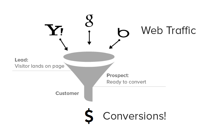
Understanding the Funnel
Creating landing pages based around traffic-driving keyword families is an important strategy for filtering organic leads, and it’s essential to understand how users flow onto your page and what they do when they get there. The power of landing pages lie within the idea that they are meant to accomplish one thing: convert viewers to leads.
There are many tools out there to help gain visibility into this area, but platforms like Mixpanel and KISSmetrics offer a much clearer picture of where you viewers are dropping off. Funnels do not necessarily need to be worked out ahead of time but instead continually optimized as the campaign continues (more on that later). For example, if you notice many users are clicking off the page due to another link, you may realize you need to cut out this distraction by removing it. One thing in common behavior people seem to have on the web extremely short attention spans. Here at SumAll, we have many landing pages and we often minimize additional unnecessary distracting navigation to the top of these pages. So what will the viewer do next?
Keep it “Above the Fold”
The term “above the fold” refers to the portion of the web page that is visible without scrolling. A slightly outdated finding in a study by Jakob Neilsen revealed 77% of website visitors do not scroll. As previously discussed, viewers don’t have time to sit and read the page to understand it’s intent. Its more of a scan – absorbing what they can through visual cues within fractions of a second.
A few good questions to ask yourself are:
- Does your landing page accomplish all of it’s intent above the fold?
- Does the page display properly in every browser with all important information and call-to-actions above the fold?
And to the last point – how can web developers ensure this will be achieved in all (or most) browsers? There are several methods including javascript that I wont get into here, but I utilize a simple pure CSS technique similar to this one.
The Call-To-Action
So someone finds your page through a properly-aligned “search intent.” They then quickly decide this is exactly what they are looking for. So how do you engage with the user to ensure they can easily move through the rest of the funnel? The answer is that a clear path must be paved to conversion through the means of a clear call-to-action. There can often be too many choices and its extremely important to keep things simple. The ultimate measure of success is the click-through rate and optimizing and testing to increase this number will greatly improve conversions.
Testing and Optimizing
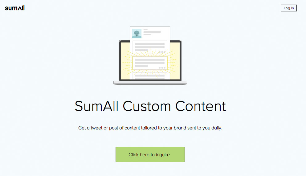
It’s very rare for you first iteration of your landing page to be the best it can be. Standard A/B testing can come in handy at this stage. For example, SumAll recently launched a new product called “SumAll Custom Content.” Our landing page first looked like this:
Our first variant contained modified copy below the headline and no log in button. We also changed the copy of the button to “Click here to inquire” to “Click here to find out more”:
What we found over a week was this new variant had a click rate of 22.1% (375 visitors, 83 clicks) while the original version has click rate of 14.4% (390 visitors, 56 clicks). These minor changes gave us a 54% increase!
Many other factors can be tested here of course with the goal to increase conversion rate as much as possible. Simple color changes and copy changes can boost conversion rates in the single digits, but this premature boost can eventually fade over time. This seems to happen when you test over a small amount of visits over a small amount of time. A few additional conversions can result in a 3% increase for example, which can seem more important that it really is. A larger sample size and longer amount of time will bring more realistic results. It’s often said that conversion rates of about 2-5% are pretty good, but there is huge opportunity to grow. Believe it or not, there are some pages out there that have conversion rates 11% to even 25% depending on the industry.
What about the rest of the page?
We’ve mostly touched upon everything above the fold – and rightly so, but what content should be on the rest of the page? This is your time to take advantage of the other 23% that do decide to scroll and tell a better a more specific story about what you are attempting to offer. Try to relate to your target market, engage, and entice them to complete the funnel. We often use secondary call-to-actions that direct the viewer to the main call-to-action. Sprinkle some keywords (naturally) around to make search engines happy.
Here is an example of a finalized page for our new reports product:
Retargeting Viewers Who Didn’t Convert
Not all hope is lost for people who left your page. Adding advertising retargeting scripts can help reel in those people who were originally interested, but perhaps weren’t ready to convert. And maybe after thorough testing and optimizing, there 2nd visit to the site will make them a customer.
Editor’s note: This story originally appeared on SumAll’s blog.


