Every WeWork space is intentionally designed to promote inspiration and collaboration. Designed to Inspire delves into the architectural and artistic elements of these spectacular buildings.
From the sidewalk, WeWork 7 Rue de Madrid looks like many of the other elegant Parisian buildings lining the neighboring boulevards of the chic 8th Arrondissement. Situated a breezy 20-minute walk from the banks of the Seine River and the Place de la Concorde, the building is in the heart of the French capital. Yet behind its historic exterior lies a hypermodern workspace that represents the past, present, and future of this cosmopolitan metropolis.
“What’s cool is you have a very classical Parisian feel from the street view, but then you have a very different interior design approach, which works hand in hand,” says Amaya Rutherford, a senior interior designer at WeWork and part of the creative team that worked on the building. Much of that contrast has to do with the fact that WeWork 7 Rue de Madrid is actually an amalgamation of three buildings.
“The existing facade is Haussmannian,” says Scott Rominger, creative director at WeWork, in reference to the iconic 19th-century style pioneered by Georges-Eugène Haussmann that has become synonymous with Parisian architecture. The second building behind the facade is a later rendition of a similar style, while the third building on the right is a modern house that has an internal vaulted ceiling covered in timber, he says. The buildings are connected by modern glass staircases.
Integrating three distinct structures built over different time periods was an inherent challenge for WeWork’s design team. Their goal: to create a workspace that felt aesthetically cohesive, while at the same time honoring the bones of the earliest structure. In order to bring everything together, the team relied heavily on a rich array of materials to create a design vernacular for the whole place.
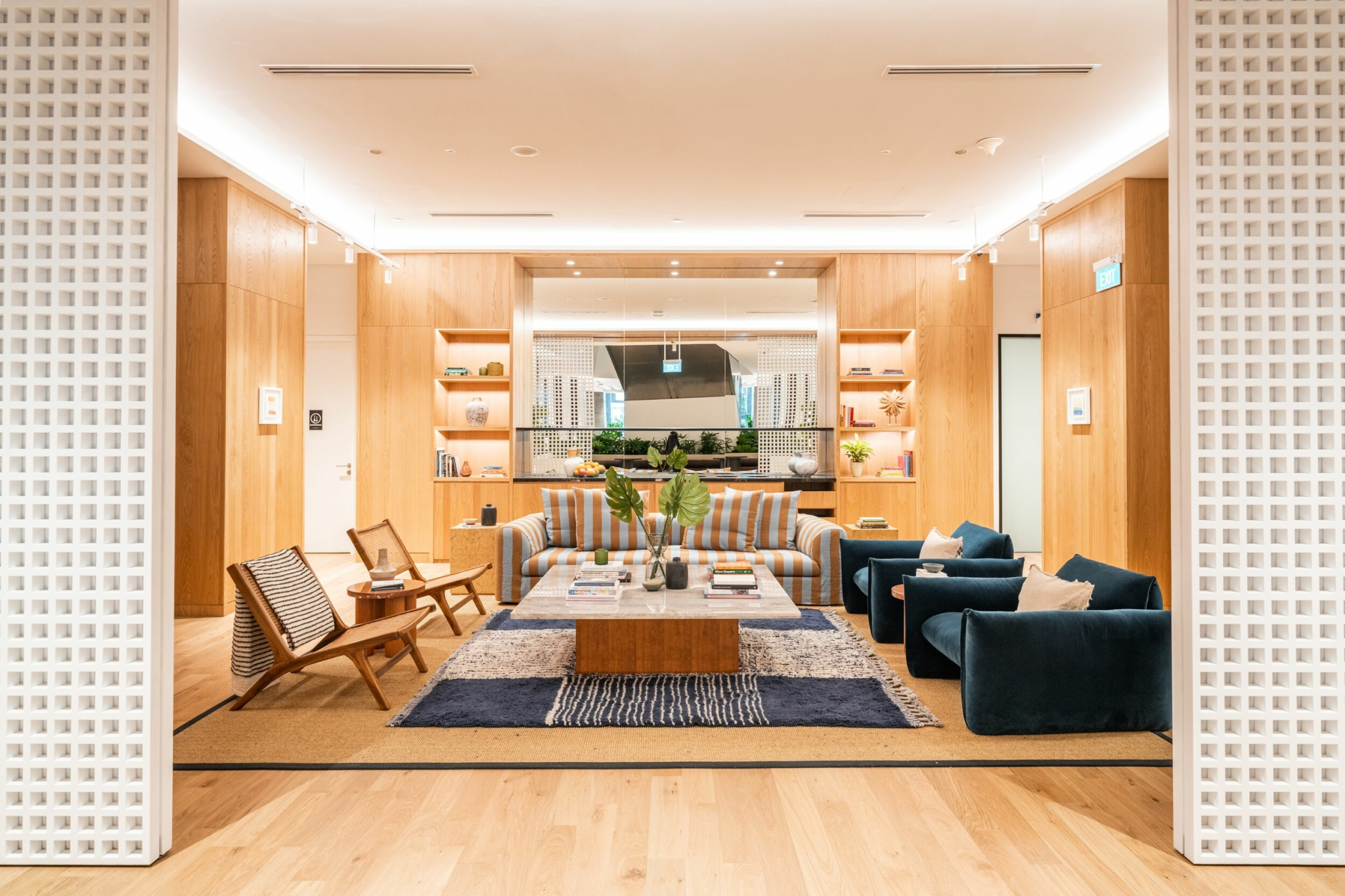
Dark walnut wood, red marble, and handmade cream-colored glazed and terra-cotta tiles throughout the premises create a sumptuous array of textures. While the warm natural wood and tile would feel right at home in a luxe Parisian abode, woven rattan lighting fixtures and Akari paper pendants add a touch of the unexpected. Rominger notes that there’s also “super-flashy white and neon” to contrast the depth and richness of these materials.
“The continuity of the materiality between the spaces helps unify them,” Rominger says. “Even though the buildings are so different, we tried to keep an aesthetic throughout.”
“We have a very natural approach when it comes to materiality,” Rutherford says. Curtains and strategically placed lighting elements help soften the overall look. “There is a juxtaposition of the textures of the rattan, but then there’s that almost clinical stainless steel. So you have a nod to a certain period, but then something quite clean.”
We try to create these little intimate moments, because the space is so grand.
Scott Rominger, creative director at WeWork
One highlight of the space is the internal courtyard, which serves as a showcase for contemporary sculptures in brilliant primary hues. It’s rare to find an expanse of outdoor space in the heart of the city, which is partly why Rominger is so proud of it. Newcomers are inevitably surprised and often delighted to find this oasis hiding in plain sight.
For members en route to a meeting, the courtyard creates a sort of visual ellipses that helps bridge the community bar with private boardrooms. “It’s such a nice experience. You get your coffee and walk through the garden. Because the ceiling isn’t so high that it’s blocking the sun, you’ll get some nice daylight here. It’s almost like MoMA PS1, because you find these moments of surprise and pops of color,” says Rominger.
Whether members cruise through the courtyard for a meeting or make their way to the top floors, they’re in for a visual treat. “The entrance sequence is quite striking,” Rominger says. “You start at street level, and then you go subterranean. That’s where the community bar and the barista is. You make your way to the garden and then to the top, which is just wow.”
While it’s unusual for a community bar to be situated below ground, the layout of this subterranean space is particularly inviting. Because it has a double-height ceiling, it doesn’t feel like a dark, moody basement. The result feels spacious and particularly suited to sharing ideas over a freshly poured espresso.
From there, members can take the elevator directly to the top floor, where they’ll find original murals adorning the seventh floor. As efficient as this speedy route is, Rutherford often encourages visitors to take the scenic route. “You have to take the spiral staircase if possible,” she says. “Light is something that’s just quite remarkable in this building in every way. Natural light is such an important part.”
Another space in which the modernity of WeWork 7 Rue de Madrid really shines is the eighth-floor mezzanine, which features a high vaulted ceiling with immense windows. Members sitting at the desks have a spectacular view of the Parisian skyline. “Everything is facing out. Everything in this area is kind of removed, so there is this quiet space where you can look out over the whole city,” Rominger says.
Light, along with a carefully curated mixture of materials, helps create a design that truly stands out. Nothing about WeWork 7 Rue de Madrid is meant to be ordinary, from its exceptional location in one of Europe’s greatest culture capitals to its historic architectural roots. Yet the team at WeWork has been careful to craft a collaborative workspace that feels welcoming rather than imposing.
“We try to create these little intimate moments, because the space is so grand,” Rominger says. From the courtyard to the community bar, there are plenty of secluded spots for a brainstorming session or a casual catch-up, all while surrounded by art, light, and the classical beauty of Paris.
Diana Hubbell has spent more than a decade covering design, art, travel, and culture for publications including The Washington Post, The Guardian, Eater, Condé Nast Traveler, The Independent, Vice, Travel + Leisure, Architectural Digest, Atlas Obscura, and Wired, among others.
Rethinking your workspace?


